How to Color With Colored Pencils for Beginners: Pressure, Layering, and Fixing White Spots
White specks, streaks and flat colors are almost always about pressure and layering, not the pencils. A beginner’s walkthrough of sharp points, light layers, burnishing and fixing mistakes — on ordinary printer paper.
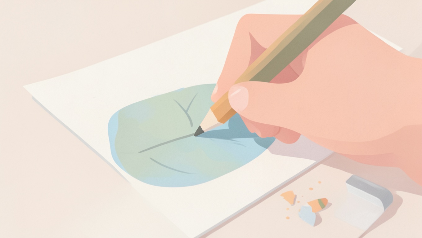
Short answer: good colored-pencil work comes from several light layers, not one heavy one; a sharp point; strokes that follow a consistent direction; and finishing with a bit of pressure (burnishing) or a light color over the top to fill the paper’s texture. Those four habits fix the three complaints every beginner has — white spots, streaks, and colors that look flat — and they work on ordinary printer paper with an inexpensive set. Here’s the how and the why, plus a ten-minute exercise that makes it stick.
First, what’s actually happening on the paper
Paper has a texture — artists call it tooth. When you drag a pencil across it, pigment catches on the high points and skips the valleys. Press hard once and you flatten the tooth, fill the high points, and leave the valleys white: that’s the white speckle you see. Go over it lightly several times and you gradually fill the valleys too, building solid, even color. The same logic explains streaks: a dull point or scattered stroke directions leave some valleys filled and others not. Once you picture the tooth, the rest is common sense.
The five habits that matter
1. Keep the point sharp
A sharp point gets into the valleys; a blunt one rides over them and streaks. Sharpen more often than feels necessary — with a hand sharpener, stop when you see a clean cone; with soft pencils (Prismacolor Premier and similar) go gently or the core breaks. For big areas you can use the side of a slightly blunted point for speed, then sharpen for edges.
2. Light pressure, many layers
Think “3 out of 10” pressure for the first layer — barely more than the weight of the pencil. Build two, three, four layers, turning up the pressure slightly as you go. The color deepens and smooths with each pass, and you keep control: you can always add more, you can’t easily take it away. A single heavy layer looks waxy, shows every stroke, and has nowhere to go.
3. Small, overlapping strokes in one direction (then cross them)
Fill an area with short strokes or tiny overlapping circles rather than long back-and-forth sweeps. Keep the direction consistent within a layer; for the next layer, shift the angle a little so the strokes cross. Crossing directions is the single best cure for visible streaks.
4. Light to dark, and at least two values per area
Start with the lightest color that belongs in the shape and lay it over the whole area. Add the mid-tone where the form turns away from the light, then the darkest where the shadow is deepest. Two or three values of the same hue — light, mid, dark — make a leaf look like a leaf instead of a green shape. If you only have a small set, you can still get a darker value by layering a touch of a neighboring darker color (a little blue or brown under green, a little purple under red). Avoid black for shadows at first; it deadens everything.
5. Finish: burnish, or glaze with a light color
When the layers are built, finish one of two ways. Burnishing means going over the area with firm pressure using a white pencil, a colorless blender pencil, or the lightest color in the area; it crushes the tooth flat and gives a smooth, slightly shiny surface with no white specks. Glazing means a light final layer of one color over everything to unify it. Burnish only when you’re done — a burnished area won’t take much more color.
Fixing the three beginner problems
White spots
More layers with a sharp point, then burnish. If spots persist, the paper is too rough for the pencils; a smoother 28–32 lb sheet or smooth cardstock helps (see best paper for coloring pages). A colorless blender pencil or a white pencil, pressed firmly in small circles, fills the last of them.
Streaks
Dull point, heavy pressure, or all strokes in one direction. Sharpen, lighten up, and cross your stroke directions on the next layer. A light glaze with the same color over the top evens most streaks out.
Flat, pale or “chalky” color
Usually too few layers, or very hard student pencils on rough paper. Add layers; add a mid and a dark value; try bright white paper, which makes the same pencils look more saturated. If the pencils themselves are waxy and pale even after several layers, a softer set makes a big difference (more below).
A ten-minute exercise that teaches all of it
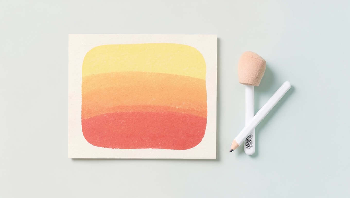
- On a printer-paper page, draw a box about 4 in long and 1 in tall. With one color, shade from near-white on the left to as dark as the pencil goes on the right, using only pressure — light, then gradually firmer. Sharpen halfway.
- Draw a circle. Decide the light comes from the top-left. Lay a light layer of one color over the whole circle, leave a small spot top-left almost white, then add a mid-tone on the bottom-right half, then a dark crescent on the very bottom-right edge. Burnish with white or the light color. You’ve just colored a sphere.
- Pick any simple page — a single flower or an animal from our flower coloring pages is ideal — and color one petal or one ear using the three-value approach. Compare it to a petal colored the “old” way in one pass. The difference is immediate.
Do you need expensive pencils?
No, but the type matters more than the price. Colored pencils come in two families:
- Wax-based (Crayola, Prismacolor Premier, most student sets): softer, lay down color easily, blend well, break more easily, can leave a waxy film (“wax bloom”) if over-burnished.
- Oil-based (Faber-Castell Polychromos, Caran d’Ache Pablo and similar): firmer, hold a point longer, layer cleanly without bloom, less creamy on the first pass.
For a beginner coloring printed pages: a decent wax-based set of 24–36 colors is plenty, and standard school pencils are fine for kids. What you will notice moving up to an “artist” set is softness and pigment load — fewer layers to reach a rich color. What you won’t get from any pencil is a shortcut around layering.
Two accessories that earn their place: a colorless blender pencil (or just a white pencil) for burnishing, and a decent sharpener. Skip solvents and blending fluids until the basics feel natural; we cover those in a separate blending guide.
Holding the pencil, protecting the page
- Hold it further back than you would for writing, so pressure stays light and strokes stay loose.
- Keep a scrap of paper under your hand to avoid smudging finished areas and to stop skin oils marking the page.
- Rotate the page so you’re always stroking comfortably rather than contorting your wrist.
- Good light from the side shows the tooth and the layers as you build them.
Fixing mistakes
Colored pencil doesn’t erase cleanly, but it lifts. Press a piece of low-tack tape or a kneaded eraser onto an over-dark area and lift it; repeat to remove more. An electric eraser takes stray marks off white paper almost completely. For a stroke over the line, a white pencil burnished over it hides a lot on printed pages, because the black outline is heavier than your slip. On the fragile end: don’t scrub with a pink eraser — it tears the tooth and the area will never take color evenly again.
Frequently asked questions
How do I color with colored pencils without white spots?
Sharp point, light pressure, several layers with crossing directions, then burnish with a white or colorless blender pencil. Smoother paper helps if spots persist.
How many layers should I use?
Three to five is typical for a smooth, rich area on printer paper; two is enough for quick kids’ coloring; professional work can run far more on toothy paper. Stop when the color looks solid and even, then burnish.
Why do my colored pencils look streaky?
Dull point, heavy first layer, or strokes all running one way. Sharpen, lighten, and cross the next layer at a different angle.
Can I use colored pencils on regular printer paper?
Yes. It has enough tooth to hold several light layers. It buckles if you press very hard or burnish aggressively over large areas; a 28–32 lb sheet feels more comfortable for that.
What’s the difference between coloring and shading?
Coloring fills a shape with a hue; shading varies its value — lighter where light hits, darker where it turns away. Two or three values per area is all it takes to move from one to the other.
Should I outline with black first?
On a printed coloring page, the outline is already there. Resist re-tracing it in black pencil; color up to it instead. If an edge looks soft, a slightly darker version of the area’s own color along the inside of the line looks far more natural.
When layering feels comfortable, the next step is blending — turning those layers into seamless gradients — which we cover next. Until then, pick a page, three values of one color, and a sharp point.